In this blog, we will deep dive into the concepts of CSS flexbox. This helps us to design flexible responsive layouts. Here, we will see flex container and flex item properties.
So Let's Get Started
🔹 Flex Container Properties
1. flex-direction
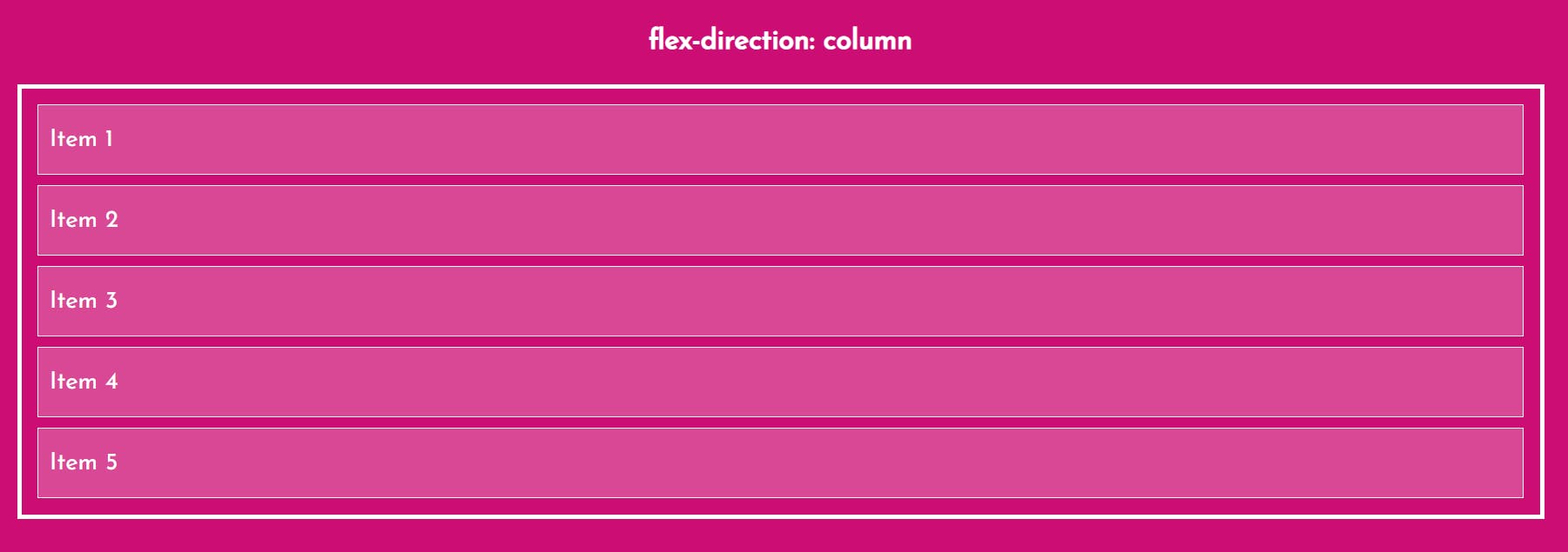
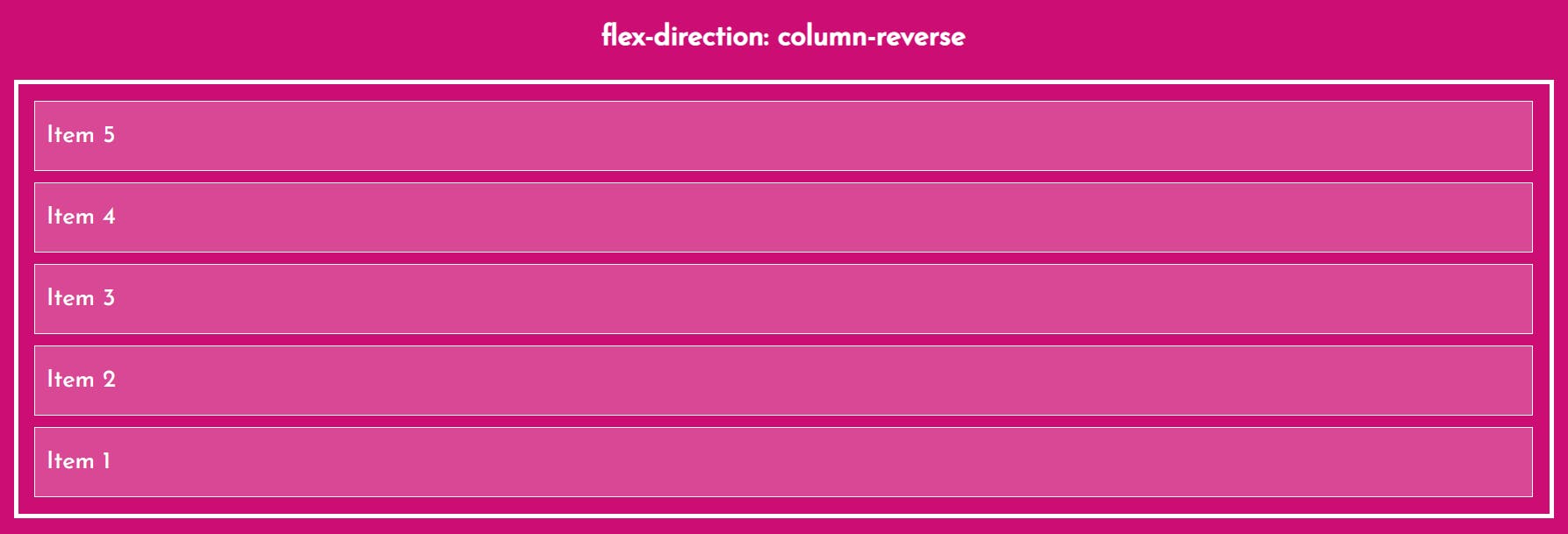
The flex-direction property defines in which direction the container wants to stack the flex items.

2. justify-content
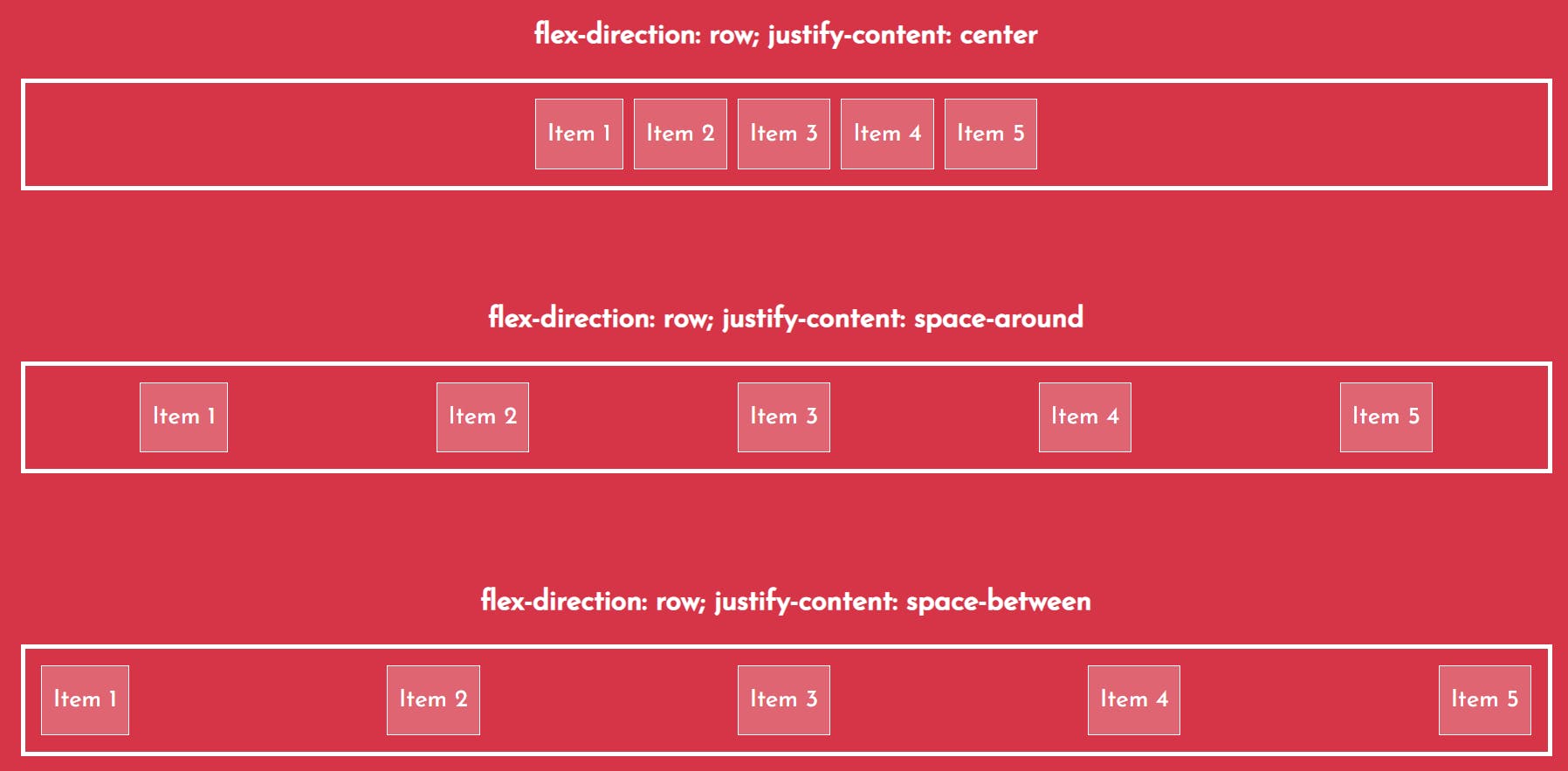
The justify-content property is used to align the flex items.

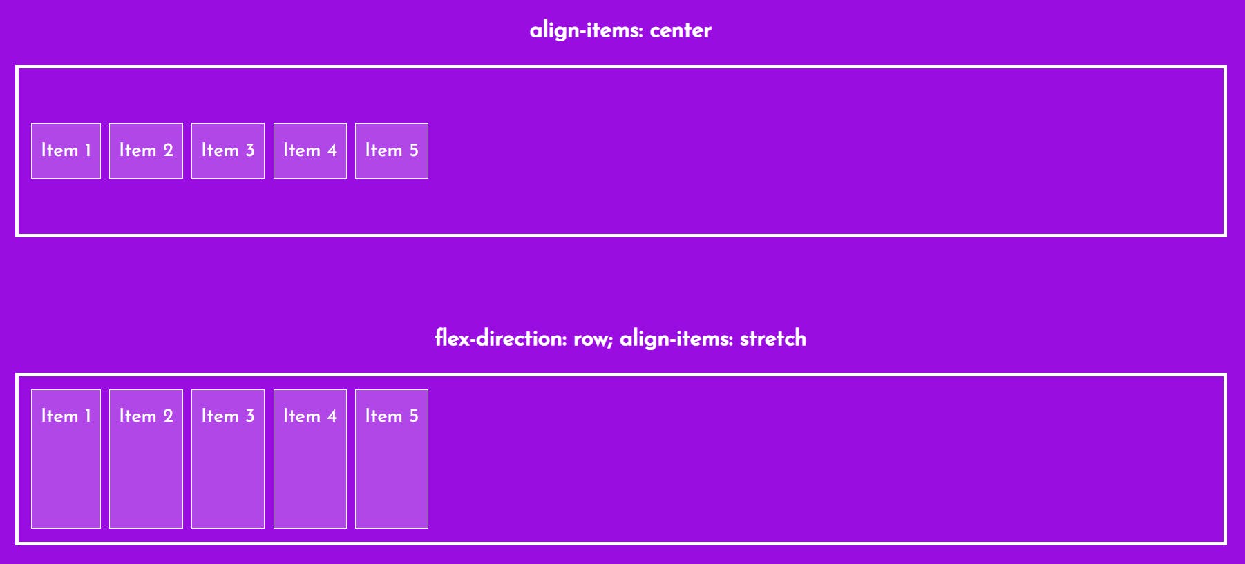
3. align-items
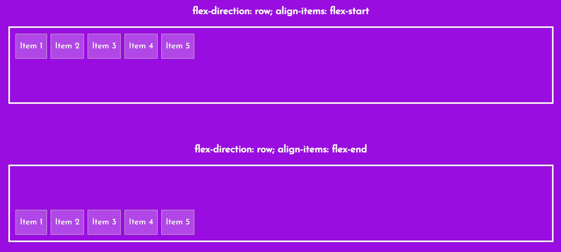
The align-items property is used to align the flex items.

4. flex-wrap
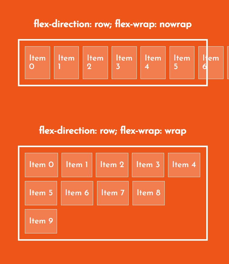
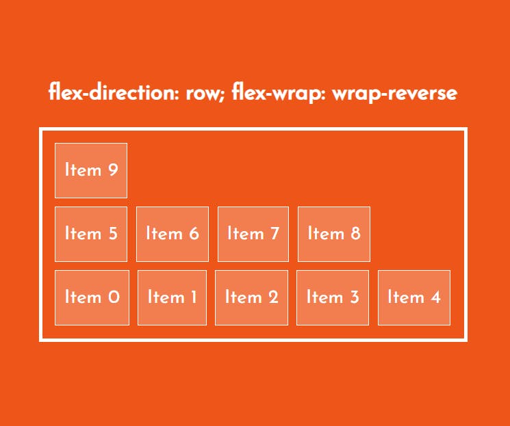
The flex-wrap property specifies whether the flex items should wrap or not.
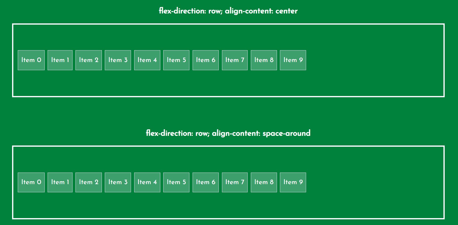
5. align-content
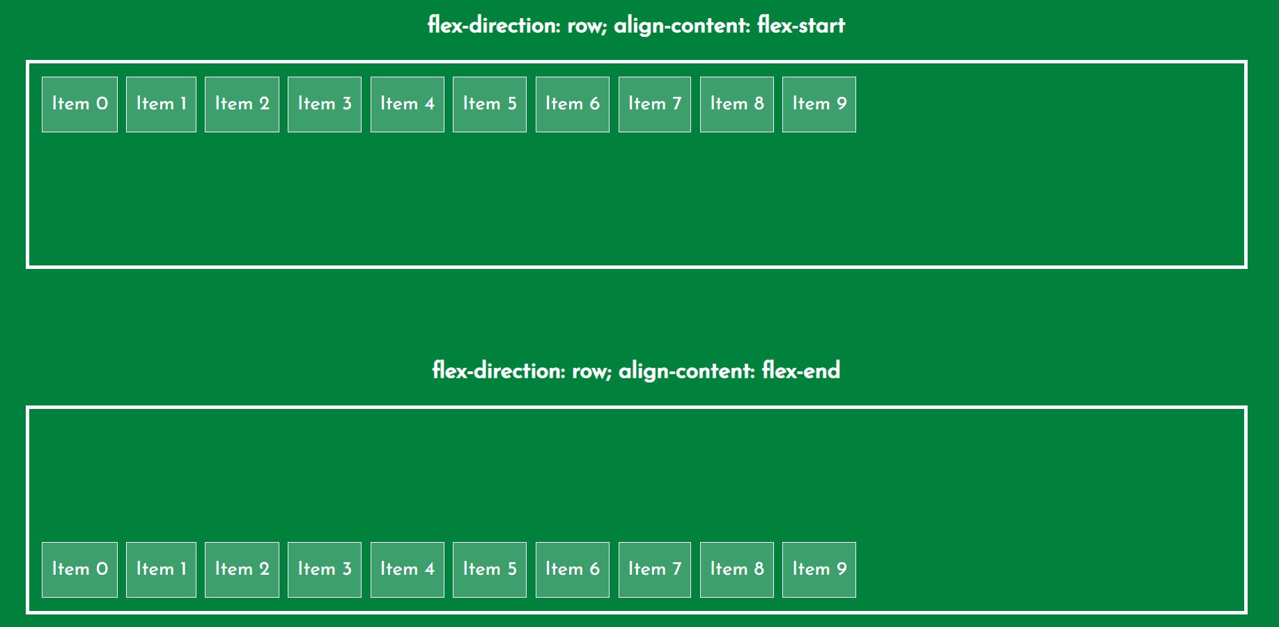
The align-content property is used to align the flex lines.

🔹 Flex Item Properties
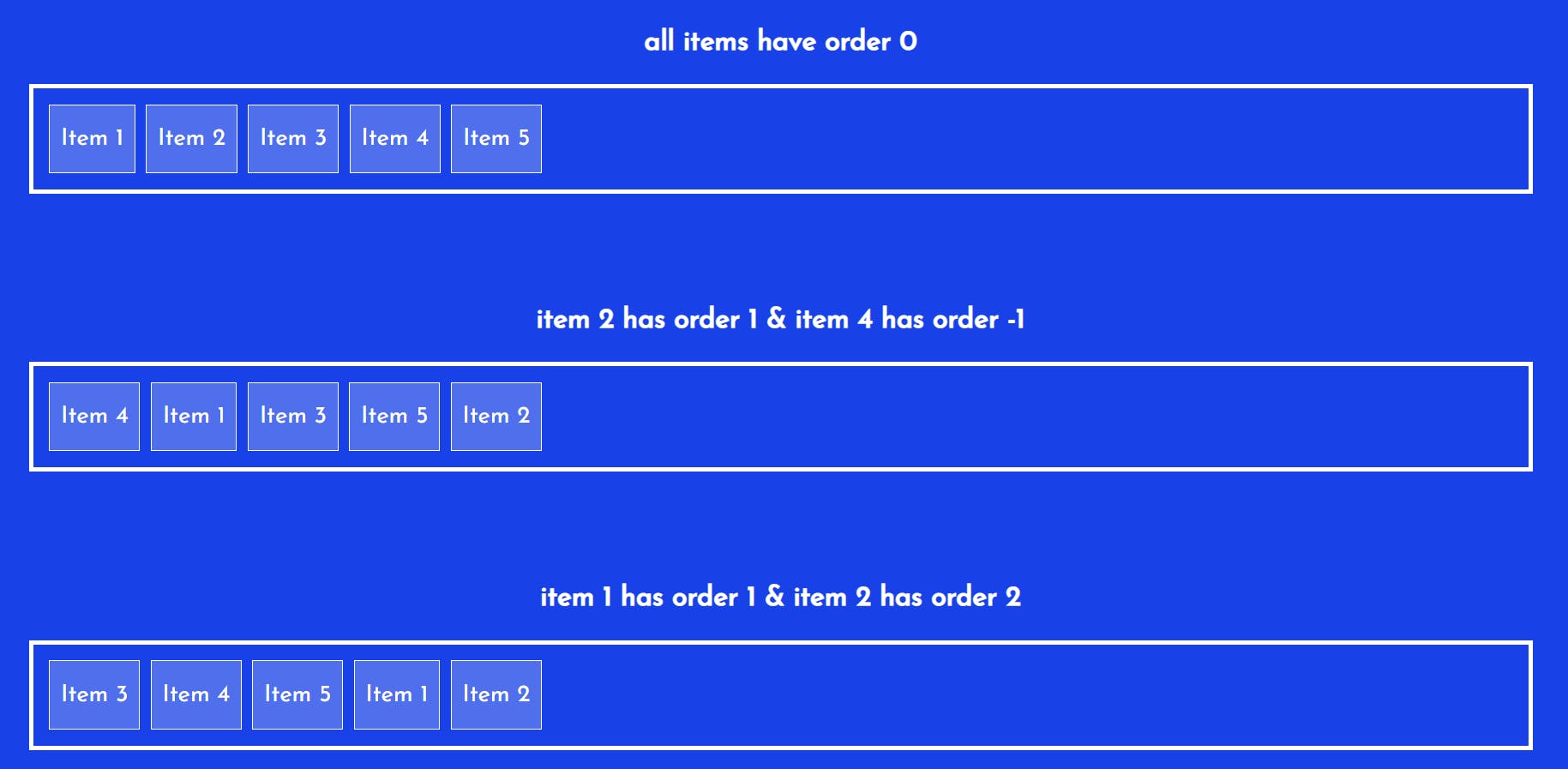
1. order
The order property specifies the order of the flex items. The first flex item in the code does not have to appear as the first item in the layout. The order value must be a number, default value is 0.
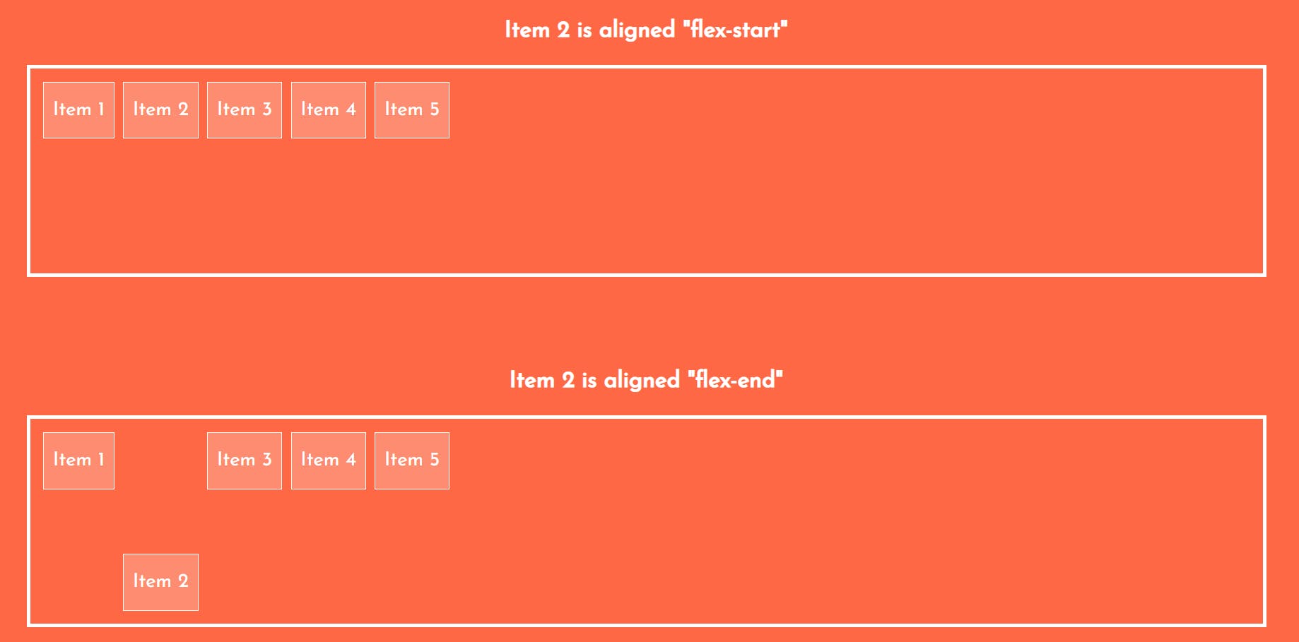
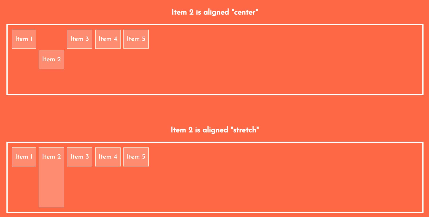
2. align-self
The align-self property specifies the alignment for the selected item inside the flexible container. It overrides the default alignment set by the container's align-items property.
3. flex-grow
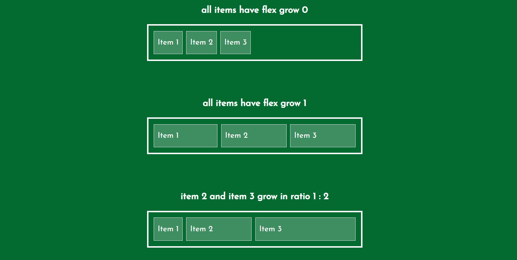
The flex-grow property specifies how much a flex item will grow relative to the rest of the flex items. The value must be a number, default value is 0.

4. flex-shrink
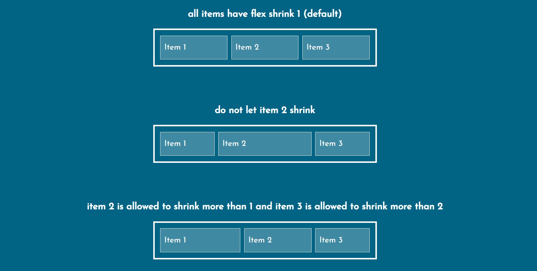
The flex-shrink property specifies how much a flex item will shrink relative to the rest of the flex items. The value must be a number, default value is 0.
5. flex-basis
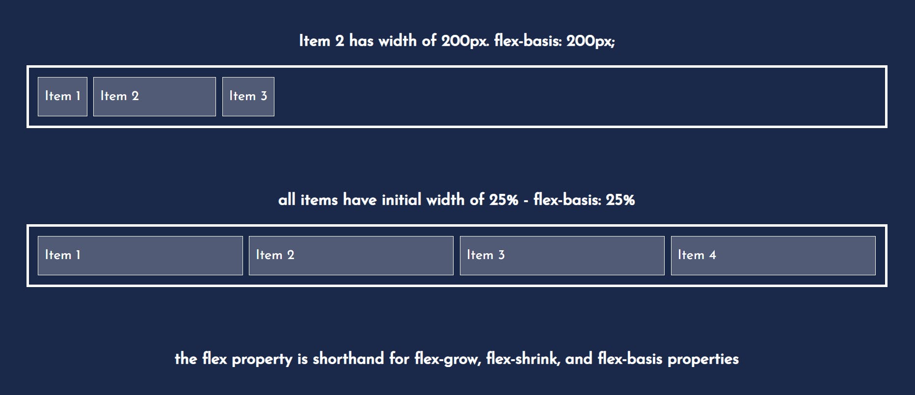
The flex-basis property specifies the initial length of a flex item.
Hope you liked this!
Let's Get Connected 🤝:)
